
 Walking in poppies last weekend
The envelope containing my negatives and CD of images dropped on the mat this morning, as always I was excited to see what I'd produced but my excitement was short lived. I have to admit I took some rubbish photographs at the weekend. There are a couple of interesting shots, but nothing to move the world, this week (I'll have to move it next week).
Several of the photographs are out of focus, which is a combination of using a wide aperture for shallow depth of field and my poor eyesight, but most of them lack contrast in one form or another.
Pass me that soapbox mother, it's time for a rant!
Contrast is one of the least understood principles of photography, I suppose it has to be mis-understood because everyone thinks they know what contrast means. Artists and designers are taught (or should be), about contrast in college. But a lot of photographers assume contrast is a property of the lens or the printing paper.
Understanding contrast is knowing what to look for and how to make adjustments to your image to improve the composition. It's putting your finger on what works and it allows you to repeat your success and avoid failure.
Contrast is one of the five pillars of design (The others are repetition, alignment, tension and proximity, maybe I'll explain the other principles in the future), unless you understand the principles your photographs are little accidents and the result of chance. You can take stunning photographs by following the rules and you can take equally stunning photographs by breaking the rules, but before you can do either, you must know the rules.
So what is contrast?
Contrast is a simple way to add interest and make objects in the composition stand out! You create contrast when two elelments are different. But here's the catch, the difference must be big! Don't mince around, be bold.
Examples of contrast
Counterchange
Counterchange is very easy, it is placing dark against light and light against dark. There's nothing new about the technique, it's been used by artists for centuries, and all great photographers since Julia Margaret Cameron have used counterchange.
 Eugenio: counterchange
Colours
You can add contrast with colours, but a little goes a long way. I tend to look for contrasting temperatures, (think cool and hot) rather than colours on the oppostite side of the colour wheel.
Space
The contrast between empty and full. If theres a lot going on in the picture, adding space will create a resting place for the eye and introduce contrast to a busy scene.
 Giving the little dog a little space.
Size
The opposite of contrast is "similar" or "same". If two objects are similar make one different.
 Similar objects - made to be different
Blur
Blur contrast against sharp, it's a powerful visual tool for the photographer. It's one of the unique elements of photography unavailable to other arts, think about it, you'll rarely see a blurred painting or sculpture.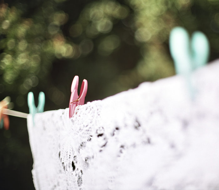
There is good blur and there is bad blur! The quality of blur is decribed as "Bokeh". To exploit bokeh and use it to create contrast you need to have a camera that lets you look through the lens (a single lens reflex or view camera). Small digital cameras are a waste of time when it comes to blur because they render almost everything sharp.
Here endeth my rant on contrast. Amen.
Such excellent examples of contrast. Pillars of design? Yes please. More please. You're a good teacher.
ReplyDeleteThe state of my environment affects me profoundly, and this has been true since childhood. What irritates or delights me is often undetectable or unnoticed by others. This is both a blessing and a curse - to me as well as to those who must interact with me.
Over the years I've learned a lot about the way I perceive the world, but it wasn't until my early 40's that I learned the pillars of design. And boy, did the lights start coming on in my brain. It was like Helen Keller suddenly understanding the sign for "water" being written on her palm. I now had a vocabulary and a category for how I experienced the visual world and, as you pointed out, once you have that knowledge you are able to replicate it and selectively break it.
Learning about the basic principles of design changed my visual life forever. I believe that people who do not consider themselves creative, or who are not interested in the concept, can improve their environment just by learning and applying the pillars of design. Whether they know it or not, good and bad design affects their well-being.
Perfect lesson, professor.
ReplyDelete